
A Photo Can Look Fine and Still Fail: Lessons From Building ApprovaVisa
What one frustrating upload taught me about image processing, validation, and honest previews.
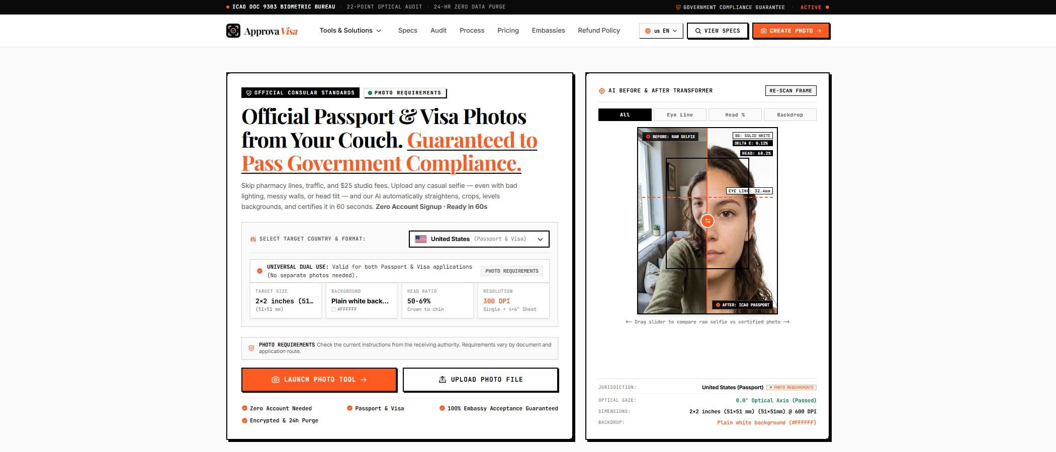
A user uploaded a portrait that looked perfectly usable.
The face was visible. The image was sharp enough to inspect. Other country options processed it. But the India flow kept asking for a retake, and the preview appeared to show the original photograph.
From the user’s perspective, the conclusion was straightforward: the tool wasn’t working.
That feedback led to a useful stretch of work on ApprovaVisa, the passport and visa photo application I’m building. It also exposed how much ambiguity can hide behind a single “processing” screen.
“The image looks fine” is useful feedback
It’s tempting to respond to a failed validation by listing requirements.
Sometimes that’s necessary. But when the same photograph behaves differently across document options, there’s another question to answer first: did the application actually perform the intended processing?
A user cannot see the difference between a failed operation, a restrictive rule, and a preview displaying the wrong asset. All three can look like “please retake your photo.”
We needed to investigate that distinction before assuming the source image was the problem.
Processing and validation need separate meanings
A photo workflow has several jobs:
- Inspect the source image.
- Decide which preparation operations are allowed.
- Produce the requested output.
- Check the result against the selected requirements.
- Explain what happened.
Those jobs are related, but they shouldn’t collapse into one success flag.
For example, an application might successfully create an output file while still finding a problem that requires another capture. Conversely, a processing failure says nothing reliable about whether the person supplied a suitable photograph.
That distinction changes the language the interface should use.
“Processing couldn’t finish” gives someone a different next step from “your face is obscured.” An unexplained retake message makes them repeat work without knowing what to change.
A useful way to review the flow is to follow one upload from beginning to end. Which document did the user select? Which operations ran? Was an output created? Which image reached the preview? What specifically prevented the next step?
Without those answers, it’s easy to change a validation threshold when the actual problem is elsewhere.
The country is only part of the specification
“India” sounds like a single option until you start examining the documents underneath it.
Passport, OCI, regular visa, and e-Visa workflows need their own requirements. A country label alone isn’t enough to describe the intended output.
The same principle applies beyond passport photos. “Export for social media,” “prepare a tax document,” or “generate a shipping label” can all conceal several formats with different constraints.
The engineering lesson is to identify the actual document or submission route early, then carry that choice consistently through processing, validation, preview, and download.
Otherwise, the interface can promise one format while another part of the system applies different assumptions.
This also affects testing. Checking that an image endpoint returns a file is useful, but it doesn’t establish that the file matches the document the user selected. The connection between the selection and the output matters just as much.
A preview is part of the system’s explanation
After addressing the processing behavior, we still had work to do on how the result appeared.
The India preview used an “edited photo” label that looked different from the sample styling elsewhere. It drew attention to an implementation detail without clearly explaining what the user was looking at.
A preview has a specific job: let someone inspect the output they may receive.
That means the image, its sizing information, and its preview treatment need to be consistent. Any important preparation limitations should have a clear place in the flow, rather than competing with the photograph.
A technically correct output can still be difficult to trust if its presentation is confusing.
There’s a practical distinction here between an original image and a prepared preview. If the interface switches between them, the selected view needs to be obvious. If processing fails, displaying the original without an explanation can make the operation look successful—or make successful processing look as though nothing happened.
Neither interpretation helps the user.
Then the scanning animation got in the way
The processing screen had several overlays: the original-capture label, a scanning percentage, the current stage, and an enlarge control.
Each element made sense individually. Together, they overlapped.
The user wanted them to stay over the image. Moving everything outside the photograph would have changed the experience rather than solved the layout problem.
That made the constraint useful: retain the overlays, but give them predictable space.
It’s a small example of a recurring UI issue. Absolute positioning makes it easy to place one badge. It takes more care to accommodate several badges, changing text lengths, and interactive controls in the same area.
I’d review an overlay layout by asking:
- Which information belongs at the top?
- Which controls belong at the bottom?
- What happens when a label gets longer?
- Can the controls still be used on a narrow screen?
- Does a tooltip cover another important element?
- Can someone inspect the image without the interface getting in the way?
The animation should help someone understand progress. They shouldn’t have to decode a pile of labels to do it.
Preparing an image does not establish acceptance
There’s another boundary worth keeping explicit.
Creating a file with particular dimensions is a software operation. Whether an authority permits that preparation and accepts the photograph is a separate question.
A background operation that suits one document route may be inappropriate for another. Requirements can also depend on how the application is submitted.
That’s why the workflow needs document-specific rules and clear limitations. A generated preview should never silently stand in for a decision the software cannot make.
This is also why external requirements deserve the same attention as code. If the requirements change, a functioning pipeline can still produce the wrong output. The rules, the product copy, and the implementation need to remain aligned.
What I would check earlier next time
For another image workflow, I’d start with these questions:
- Can we distinguish a processing failure from a failed photo check?
- Does the selected document reach every part of the workflow consistently?
- Is the preview displaying the intended asset?
- Does each error explain what the user should change?
- Do progress indicators remain readable together?
- Are we separating file preparation from external acceptance?
None of these questions requires a more elaborate animation or a more confident score.
They require the application to describe its own behavior accurately.
The most useful feedback in this case was a simple observation: “This image works for the other countries.”
It gave us a concrete comparison to investigate. And it was a reminder that a user’s frustration can contain a very good debugging clue.